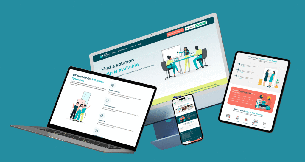
In 2025, digital experiences are no longer just “mobile-first.” We’re in a multi-device world where users seamlessly shift between smartphones, tablets, foldable screens, wearables, smart TVs, and even AR/VR environments.
For designers and businesses, responsive design is no longer optional; it’s a survival. Whether you’re running an e-commerce store, a SaaS platform, or a brand website, your design must adapt fluidly across devices to deliver consistent, high-quality user experiences.
In this blog, we’ll explore the latest trends in responsive design and share practical tips to make your digital products future-ready.
Why Responsive Design Still Matters in 2025
Responsive design ensures your website or app adapts to every screen size without breaking usability.
- Mobile-first no longer enough → Users expect the same smooth experience on tablets, foldables, and even car dashboards.
- SEO boost → Google prioritizes mobile-friendly and responsive sites in search rankings.
- User trust → An awkward mobile experience = increased bounce rates and decreased conversions.
Example: A study by Adobe (2024) found that 67% of users will leave a site if the mobile version is hard to use, even if they love the brand.
Key Responsive Design Trends in 2025
1. Foldable & Dual-Screen Devices
Foldables are going mainstream (Samsung, Oppo, and Google Pixel Fold). Designers have to design layouts that unfold, split, or change shape when screens fold or unfold.
Action Tip: Design adjustable grid systems in Figma that can scale or reduce effortlessly.
2. Fluid Typography & Variable Fonts
Those days of fixed font sizes are behind us. Designers now employ fluid typography that resizes automatically depending on viewport size.
Action Tip: Apply CSS clamp() to scale type between min/max.
3. Gesture & Voice-Friendly Interfaces
Mobile-first has evolved into touch-first + voice-first. Responsive design in 2025 means considering gestures (swipe, pinch, long-press) and voice navigation.
Action Tip: Test designs for accessibility with both touch interactions and voice commands.
4. Performance-Centered Design
Users expect speed. Heavy animations or unoptimized images can kill engagement.
Action Tip: Use responsive image formats like WebP/AVIF, and lazy-load media for faster rendering.
5. Beyond Devices: AR & Wearables
Designers also now adapt content for Apple Vision Pro, AR glasses, and smartwatches. Responsive design means your content hierarchy should work in any context, even if users are glancing at a smartwatch notification.
Action Tip: Start with content-first design → prioritize what info matters most per device.
Actionable Guide: How to Design Responsively in 2025
Step 1: Plan with Content Priority
- Identify the “core” information users need across devices.
- Example: On a smartwatch → show only notifications; on mobile → quick actions; on desktop → full dashboard.
Step 2: Use Flexible Layouts
- Design with CSS Grid & Flexbox for fluid layouts.
- Ensure grids can expand for tablets and collapse for mobile.
Step 3: Adopt Mobile-First, But Test Multi-Device
- Start from mobile (the smallest limitations).
- Scale upward → tablets, desktops, TVs.
- Don’t stop there, test on foldables, AR devices, and wearables.
Step 4: Optimize Performance
- Compress all images before publishing.
- Use responsive breakpoints (e.g., srcset) for images.
- Avoid unnecessary JavaScript-heavy animations.
Step 5: Test with Real Users
- Use tools like BrowserStack to test across devices.
- Gather real user feedback → Is the design smooth on foldables? On iPads? On low-end Android phones?


