


Dashboards are the heart of any digital product. They are where users track progress, make decisions, and get insights at a glance. But when dashboards are overloaded with information, poor layouts, and confusing navigation, they stop being helpful and start becoming frustrating.
At Design Dream, we recently worked on a client project in which their original dashboard was cluttered, inconsistent, and overwhelming for users. Our task? Simplify the experience without sacrificing any of the key data.
In this blog, we’ll take you behind the scenes of how we transformed that messy dashboard into a smooth, intuitive, and wonderful user experience.
The Problem: What We Started With
The client’s original dashboard had:
- Overloaded charts and graphs with no hierarchy.
- Too many colors are fighting for attention.
- Complicated navigation that frustrated new users.
- No clear call-to-action or quick-access shortcuts.
The result? Users spent more time figuring out the dashboard than actually using it.
Our Approach: Step-by-Step Transformation
1. Understanding the Users
Before redesigning, we conducted quick UX research:
- Who uses this dashboard daily?
- What data points matter most to them?
- What frustrates them about the current version?
This gave us clarity on what needed priority and what could be simplified.

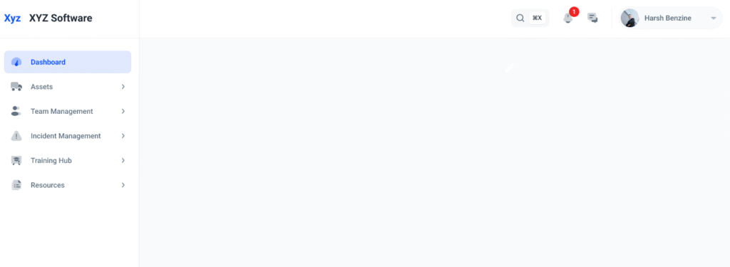
2. Decluttering the Layout
We started by grouping related data and removing unnecessary widgets. White space became our best friend, giving breathing room between sections.
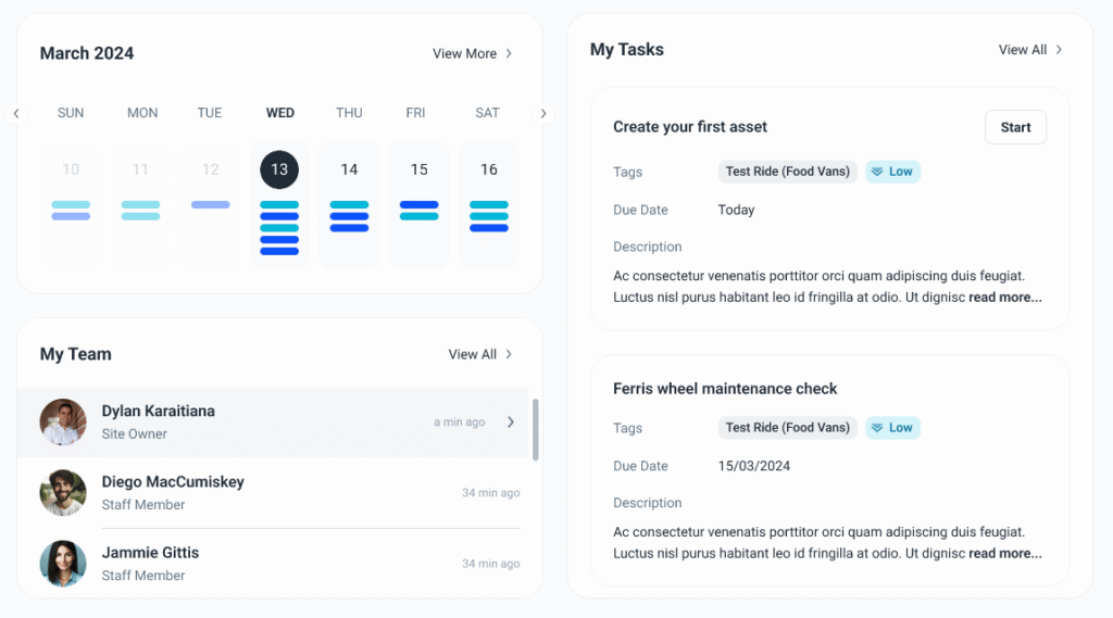
3. Designing for Hierarchy
We used visual hierarchy principles:
- Primary KPIs at the top (quick-glance insights).
- Secondary details below in collapsible sections.
Consistent typography for easy scanning.
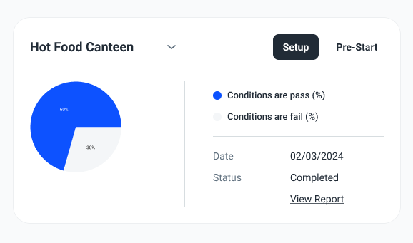
4. Color & Consistency
The old dashboard used too many random colors. We reduced it to one main brand color, one secondary, and neutrals. This made the data easier to read and reduced visual noise.
5. Interactive Improvements
We introduced:
- Hover states for quick tooltips.
- Search + filters for data exploration.
Sticky navigation bar for faster switching.
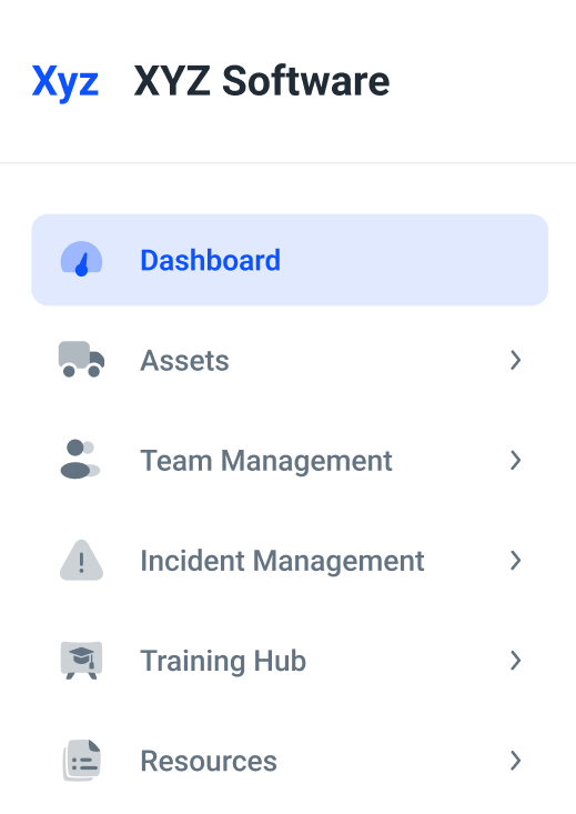
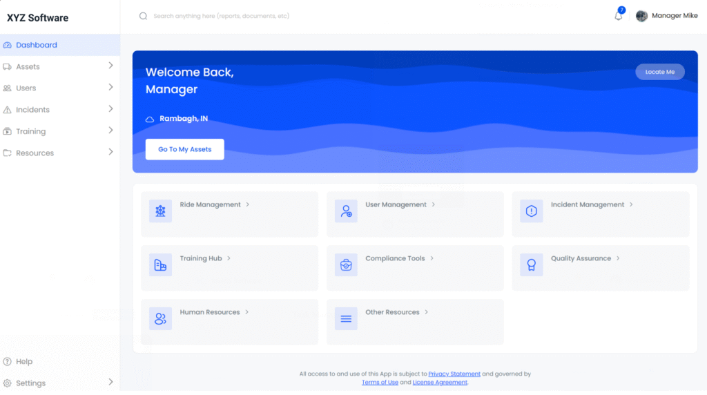
The Results: Smooth, Intuitive, Engaging
The new dashboard resulted in:
- 40% reduction in task time to complete (users achieved insights sooner).
- Reduced onboarding time, and new users understood it within minutes.
Positive feedback from the client’s internal teams.

Key Takeaways (For Your Product Too)
- Start with users. Understand their top goals.
- Simplify ruthlessly. Every element should have a purpose.
- Design hierarchy: Show the most important info first.
- Consistency wins. Fonts, colors, and icons must go together.
Test and refine. Real feedback drives real impact.

Conclusion
A dashboard isn’t just a place to show data; it’s a decision-making tool. Well-designed, it will save the user time, minimize frustration, and create trust in your product.
At Design Dream, we see each design problem as a chance to turn confusion into order. And this transformation is just one example of how thoughtful UX design can drive measurable impact.
Want us to redesign your product dashboard? Get in touch with us here.


